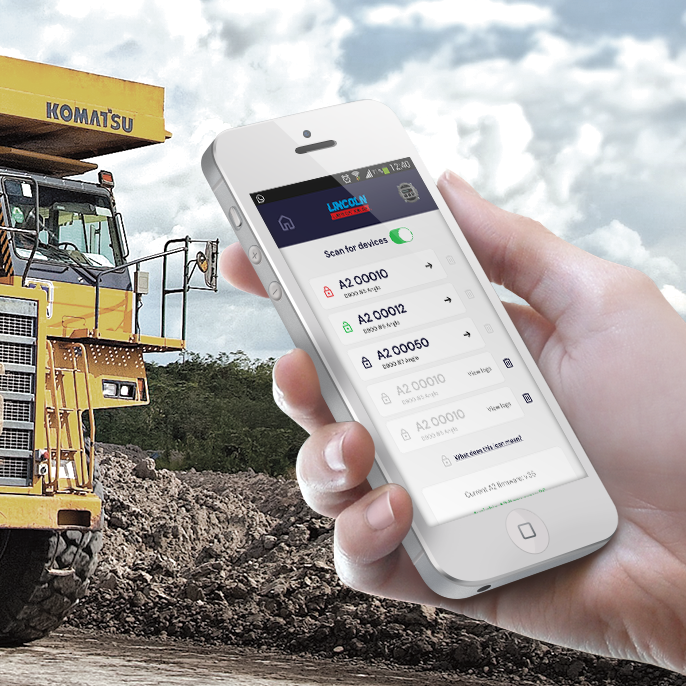
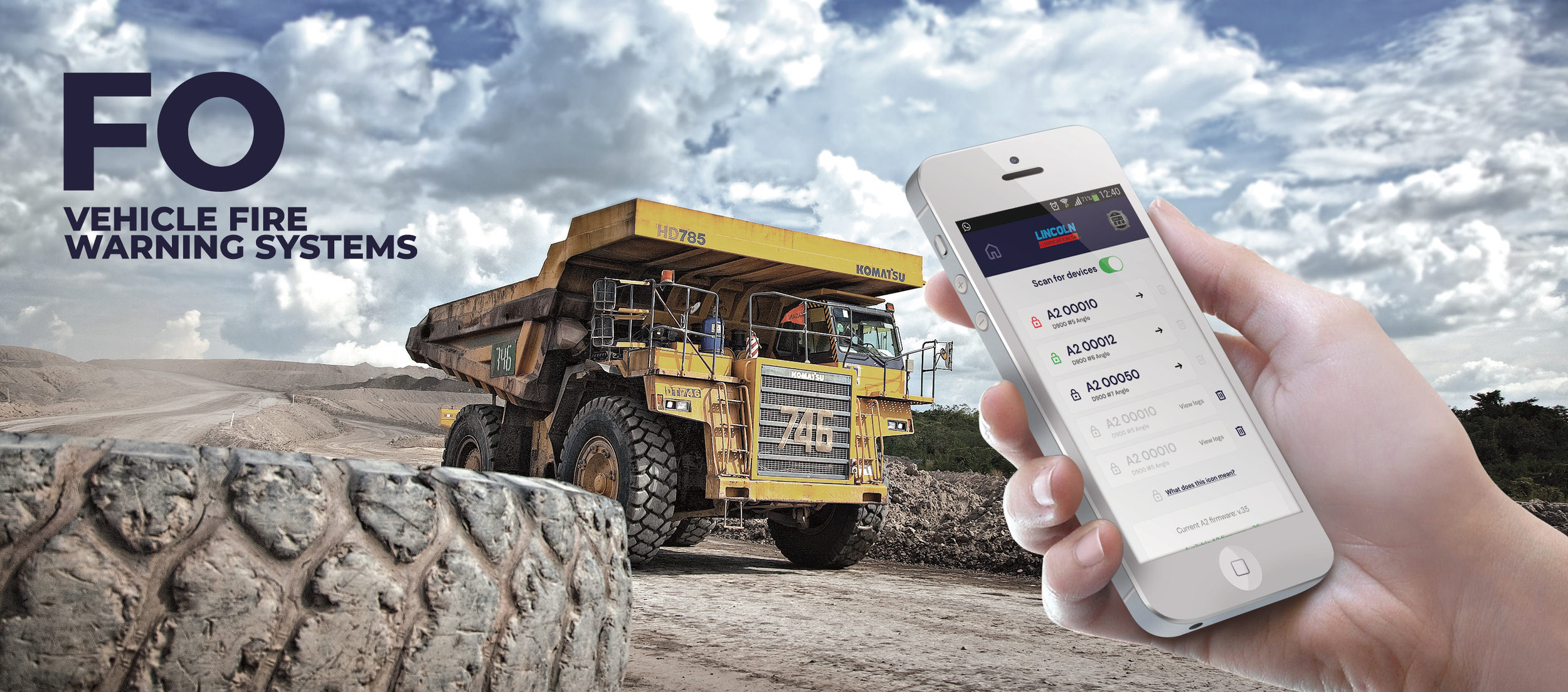
FO manufacture and install fire warning consoles into large industrial vehicles. As part of their unique offering, they provide a mobile app that can be used to remotely control the consoles in the vehicles as they are on the move.
FO were happy with the general underlying UX of their app, but from some internal research, found that the UI of the app was poor and was not presenting the app and the UX in the best light. It looked unprofessional and was creating user problems.
This is a very functional app used by people who are on the move in their trucks as well as users in the head office who are using the app to control the fire warning consoles remotely.
The app needed to be free of unnecessary clutter and help the user complete the tasks and tests that they needed to do without any fuss or complication.
The company wanted to license the app to other companies, but while it had a functional app, it didn’t have a professional looking one.
GOALS:
Understand the main app UI friction points
Improve the app UI experience
Create a UI that could be white-labelled for other brands who would license the app
CHALLENGES:
No branding guidelines
No design system
No formal quantitative or qualitative research feedback
Short deadline. The app with new UI needed to be relaunched in less than a month. I had one week to improve the experience
The business has been using their app for awhile and while the general UX feedback was good, they knew their UI wasn’t up to scratch.
OVERVIEW OF MAIN STEPS
A review and audit of all the relevant screens and the current UX journey flows.
Identify primary user flows
A rapid user test session of the app to understand the main friction points and UI failings using the primary user flows
Create a conceptual UI direction option for the client.
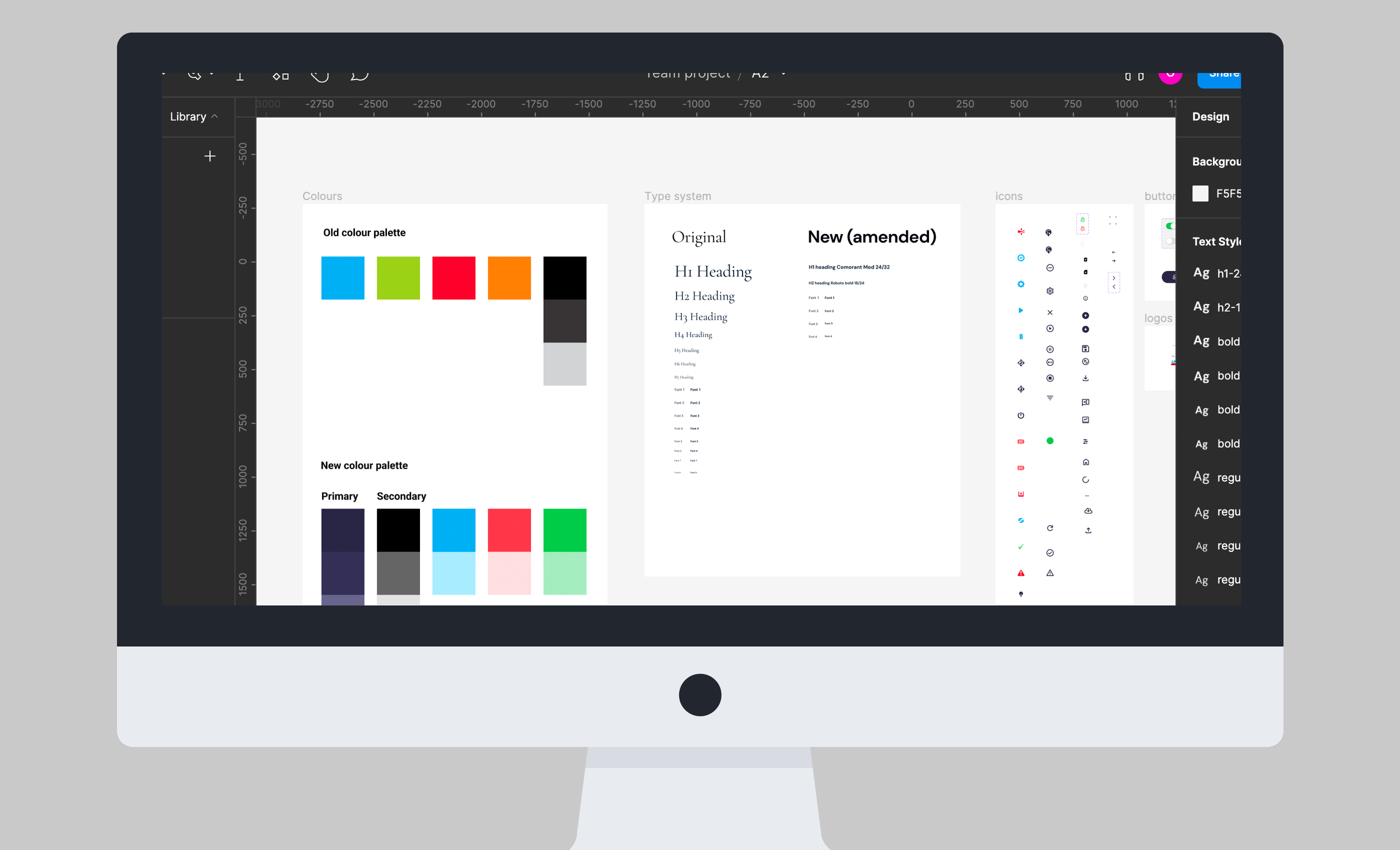
Create a framework for a new app design system.
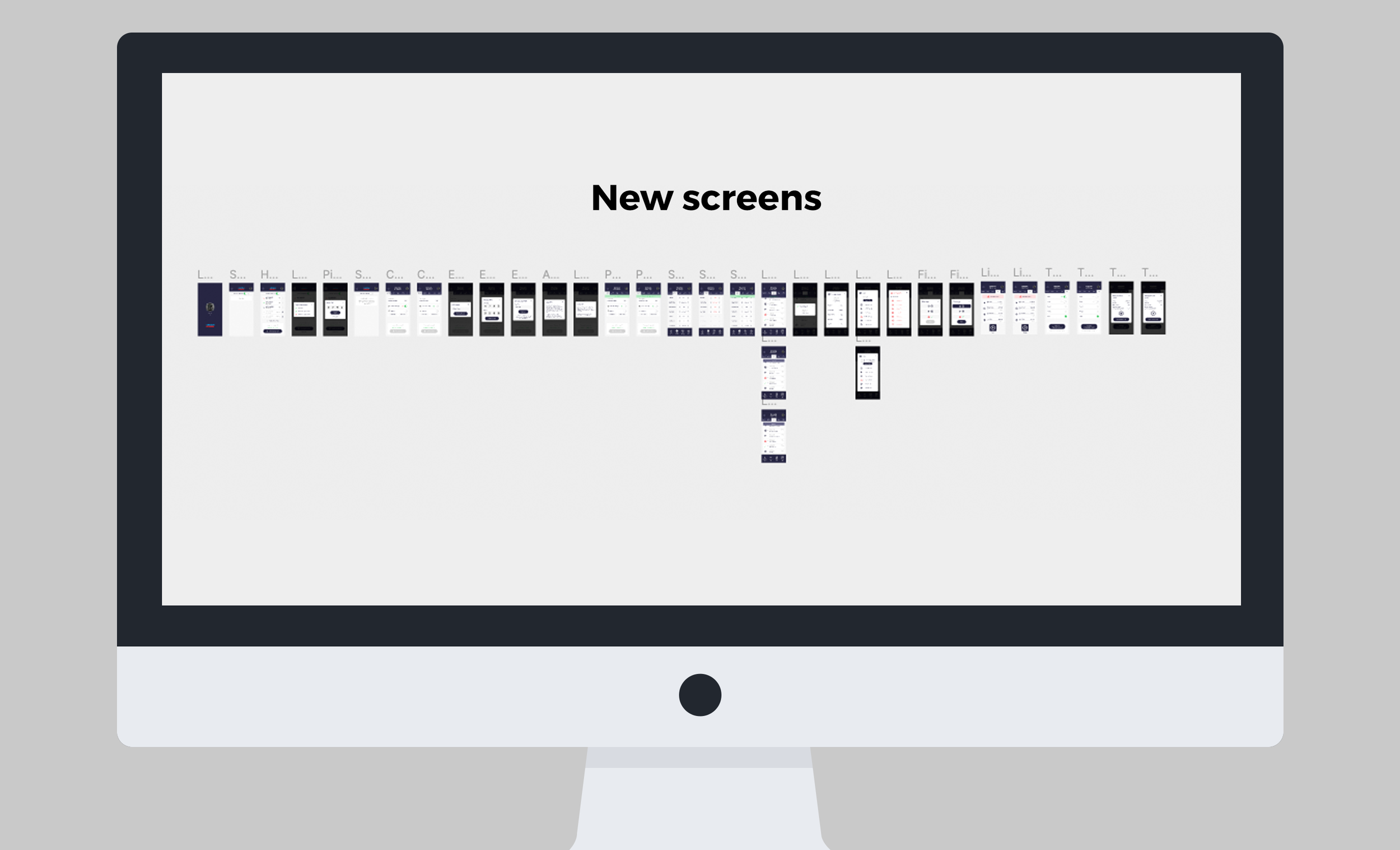
Obtain sign off on a creative UI direction and roll out app screens.
Create prototype using the new screens
Rerun the rapid user test session of the app to verify improvements and goals and surface any further friction points.
PASSIVE RESEARCH
As always as one of my main steps, I conducted research into similar services and how they presented themselves in terms of branding and UI. I pulled these influences and inspirations together and presented them to the client.
USER TESTING
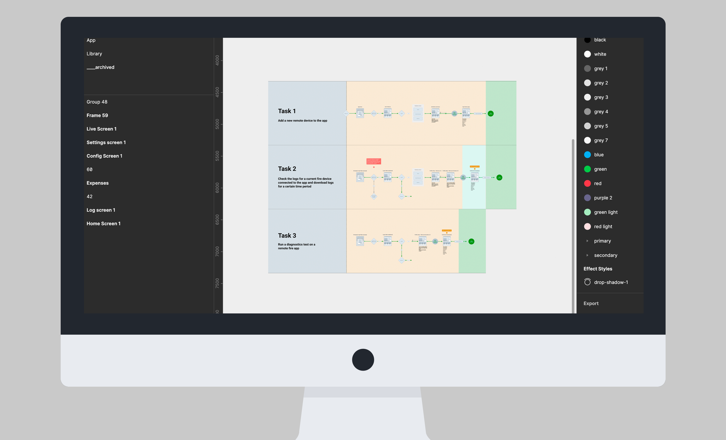
I identified 3 major tasks (user flows) that users needed to do on the app and then I asked 5 users to attempt these tasks and recorded their actions and feedback.
The tasks were:
Add a new remote device to the app
Check the logs for a current fire device connected to the app and download logs for a certain time period
Run a diagnostics test on a remote fire app
THE FINDINGS:
Overall, the tasks were completed, but not smoothly and with some guessing at times
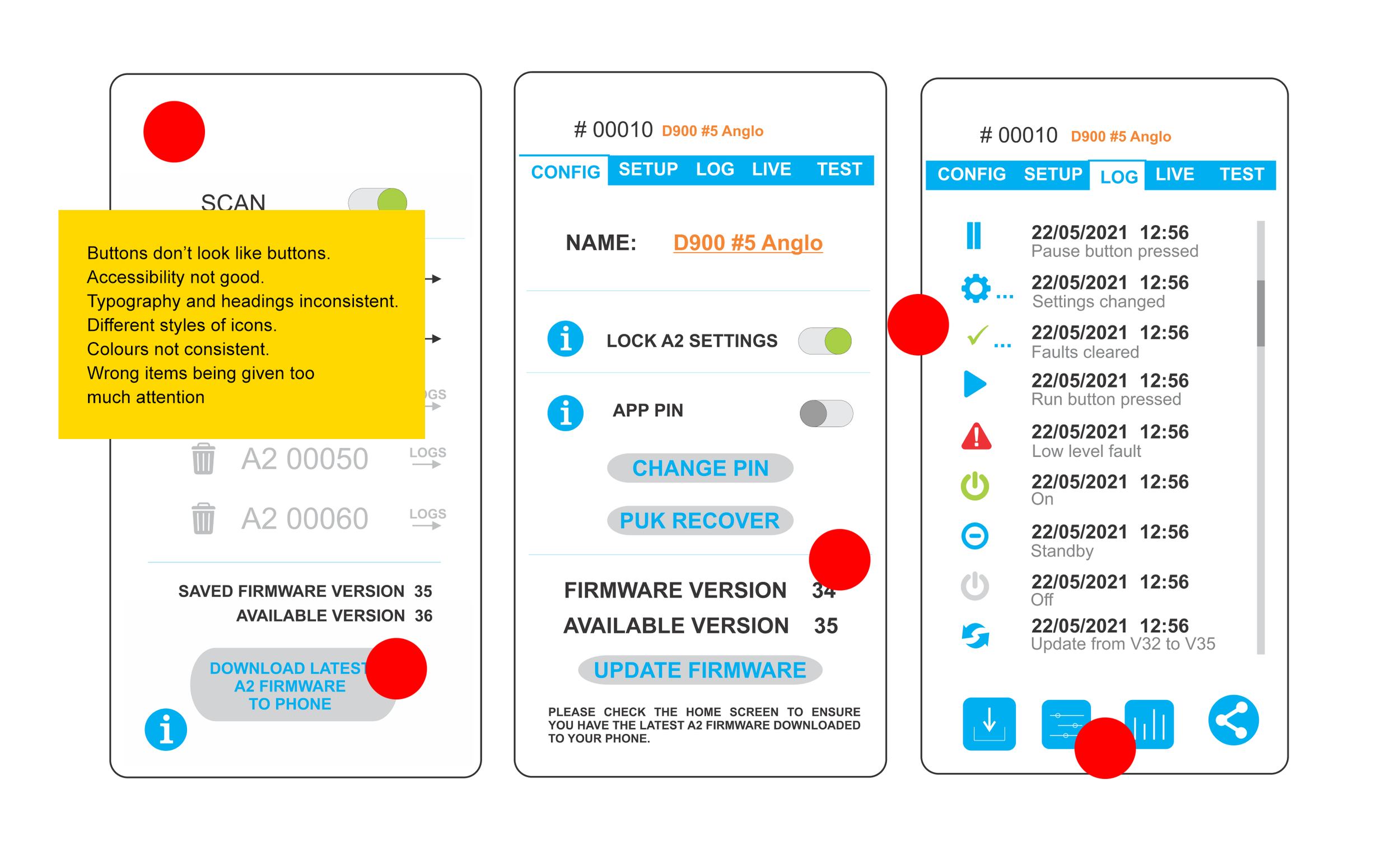
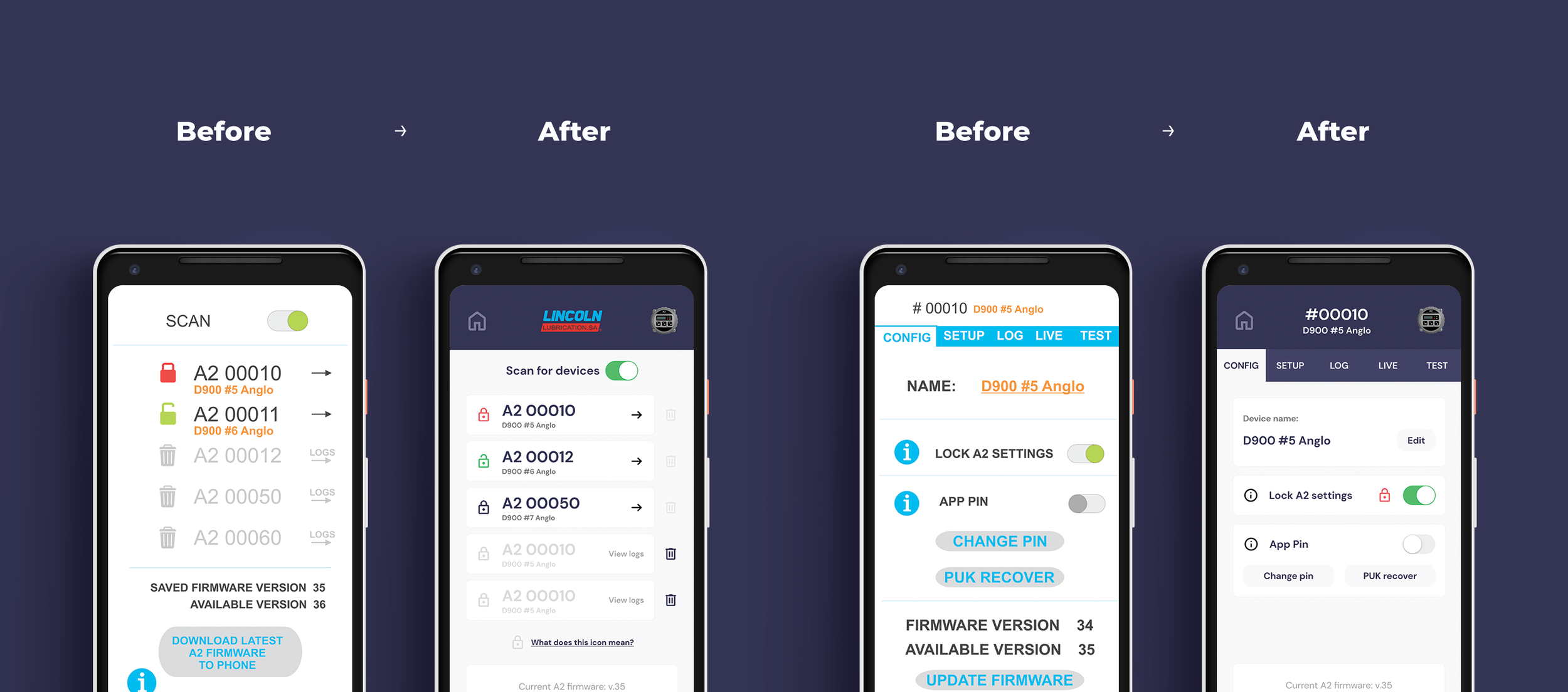
Some of the icons caused confusion and were not intuitive
Lack of button and feedback micro interactions was causing confusion and doubt
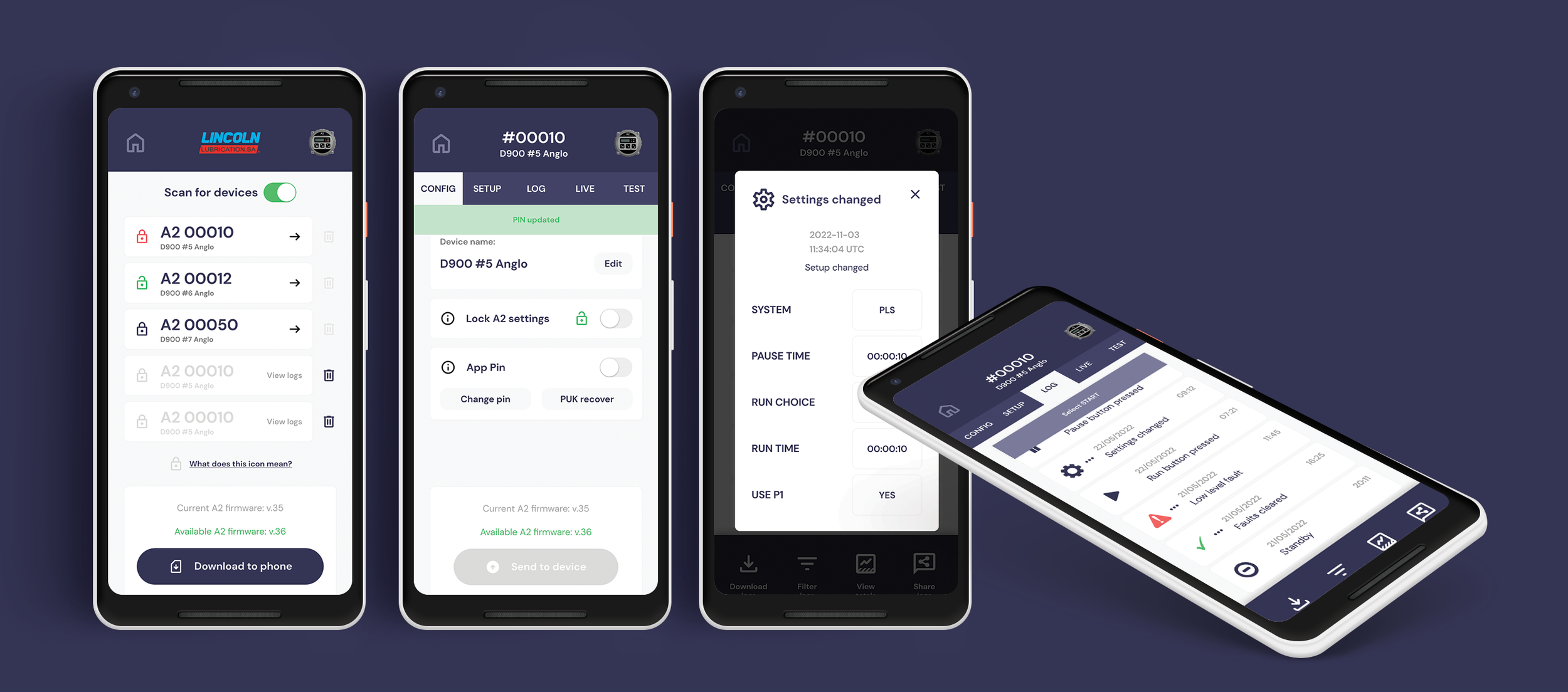
Screen titles and overall navigation was confusing and needed clearer cues and highlighting
There were areas which needed clearer communication and labelling which would improve UX
Typography: There was a lack of consistency with typography and headings. No thought had gone into text or labelling or additional information copy
Colours: The colour palette looked cheap and there weren’t enough colour variations for different interactions.
Using my findings above and with the end goals in mind, I:
Created a new typography system, something that was modern and mobile friendly
Selected a new colour palette, something that was neutral enough to work with white labelled versions as well as giving enough options for the various user interactions.
Rewrote titles, labels and other copy where necessary, eliminating redundant copy and improving signage and app communication
Redesigned each screen of the app and attempted to keep the UI design principals in mind at all times, namely: Place users in control of the interface; Make it comfortable to interact with a product; Reduce cognitive load; Make user interfaces consistent
Using the newly designed screens, I created a prototype and asked the same 5 testers to go through the same three task scenarios as before. I also white-labelled the app with a fictitious company.
THE OUTCOME:
40% faster completion times with less errors.
Users felt much more confident at every point in the scenario.
Users agreed the app felt calmer and more intuitive.
”I felt much more confident that I was on the right path”
“I love the new colours and design, the app feels faster and slicker”
“Yes, goals are much easier to accomplish now and there is more communication from the app on each step”