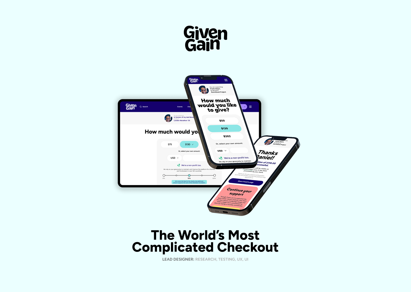
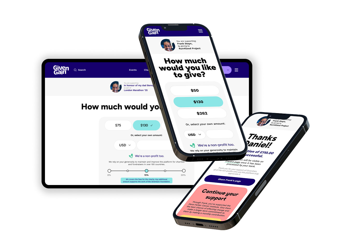
Making Donation Payments Feel Faster, Safer And More Personal Across Three Distinct Regions.
The Challenge
GivenGain’s donation journey was one of the most commercially and emotionally important experiences on the platform. It had to turn a moment of intent into a completed donation while serving donors across the United States, United Kingdom and Rest of World.
The challenge was not simply to make checkout look cleaner. The journey needed to work for people who were often donating quickly, on small screens, after arriving from social media, email or a fundraiser’s shared link.
We had limited tracking data, but we knew that around 80% of donors completed payment on mobile. That meant the donation experience needed to be designed mobile-first, not adapted from a desktop checkout.
At the same time, the journey had to accommodate regional requirements and expectations:
United States: Local currency, familiar payment methods (incl checks and bank transfer), tax receipt expectations and address requirements. We also added new payment integrations for Crypto and DAFpayments (Donor Advised Funds).
United Kingdom: Gift Aid eligibility and declaration, GBP payments and GDPR-compliant consent.
Rest of World: Varied currencies, payment methods, address formats and privacy requirements.
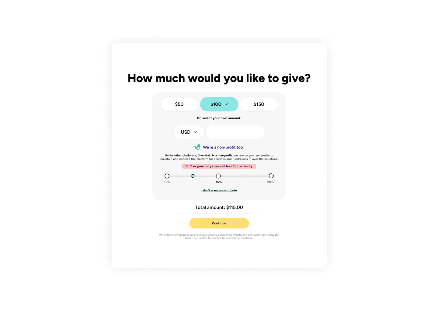
There was a crucial additional commercial and mission-driven consideration. As an NGO ourselves, GivenGain offered donors the option to add a voluntary contribution on top of their chosen donation. This supported continued investment in the platform, additional fundraising services, and GivenGain’s own charitable giving.
The design challenge was to make that contribution feel transparent, useful and optional, i.e, not like a hidden fee.
Project Facts
My Role: Lead Product Designer (sole designer)
Scope: UX Research, Product UI
Teams: Product, Engineering and external partners where relevant
Period: 6 months (2024)
My Role
I led the product design work from discovery through to final UI design.
This included:
auditing the existing donation experience
synthesising donor, charity and internal stakeholder needs
defining a mobile-first information architecture
mapping regional rules and experience differences
exploring low-fidelity interaction models
designing high-fidelity UI and reusable components
collaborating with product, engineering, payments, legal and customer support teams
defining success measures for launch and optimisation
The Problems
The existing donation journey worked, but it created unnecessary friction at the exact moment donors were deciding whether to complete payment.
Several problems emerged through journey audits, behavioural data, support feedback and usability testing.
The emotional reason for donating disappeared too early.
The mobile experience felt dense and demanding.
Regional variations were layered onto one generic form.
Communication around transaction fees and who was responsible for covering them lacked clarity.
The GivenGain contribution option lacked clarity.
Trust signals were present, but not at the moments donors needed them.
Research and discovery
I treated the journey as more than a checkout flow. It was a trust journey. The key question was:
How might we help donors feel emotionally connected, fully informed and confident enough to complete payment quickly?
Inputs & Data
My research combined several sources:
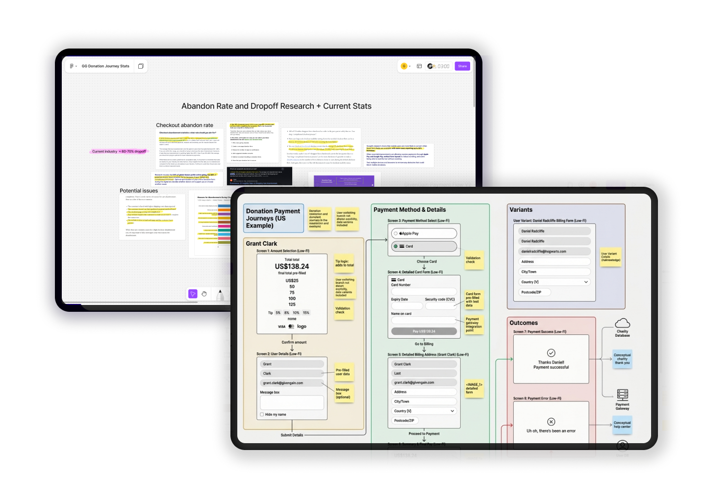
Funnel analysis across device types, regions and payment methods
Review of drop-off points and payment failure states
Customer support themes and donor complaints
Usability testing of the existing journey
Interviews with fundraisers, donors, and internal support teams
Competitive review of leading charity and consumer checkout experiences
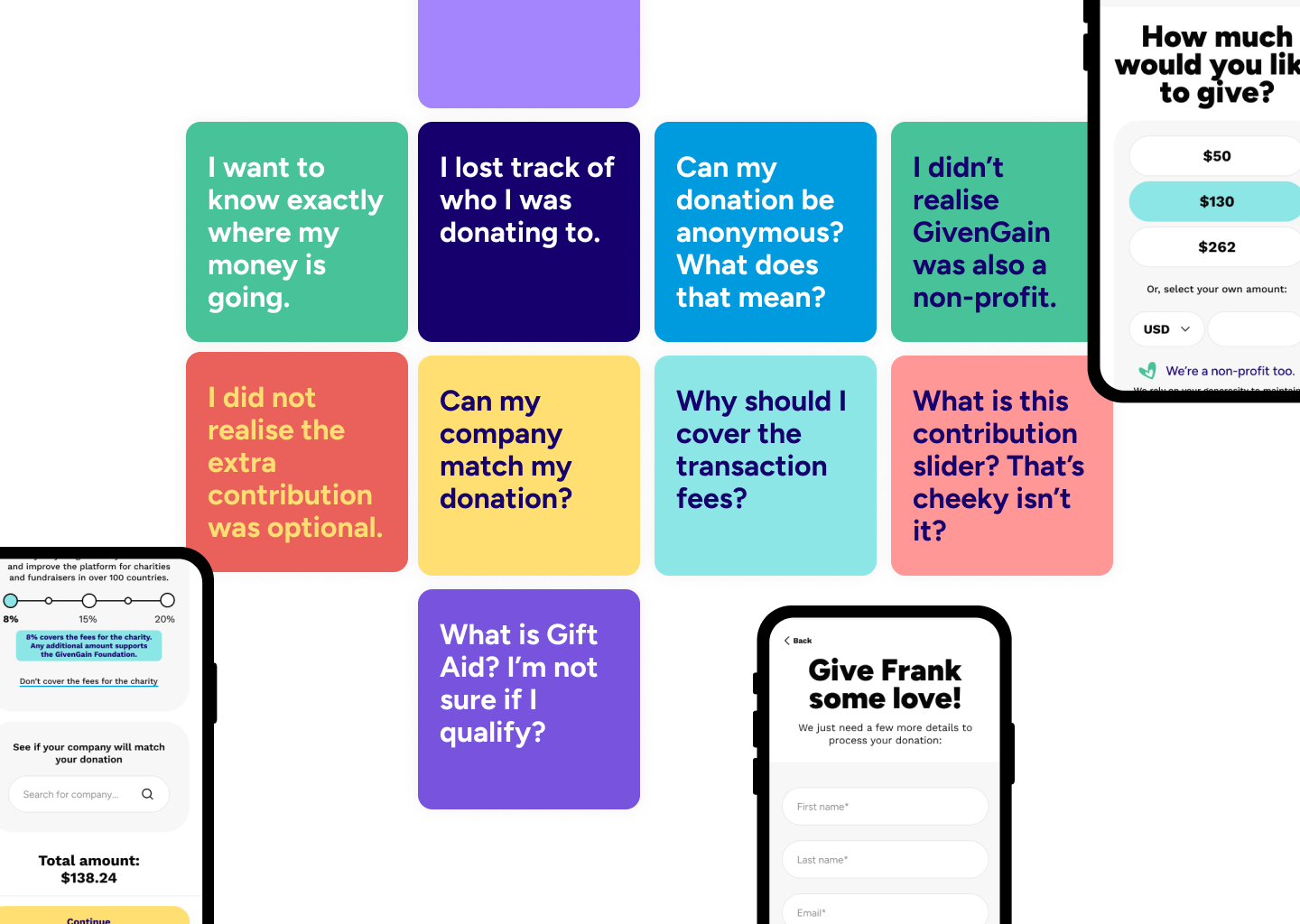
Some of the insights that came out of my research.
Design Principles
The research led to five principles that I used to guide the redesign:
1. Keep the charity or cause visible
Every screen should remind the donor who they are supporting and why.
2. Make the total unmistakable
Donation amount, voluntary contribution and final charge should always be easy to understand.
3. Design for one-handed mobile completion
Large tap targets, short sections, clear progress and minimal typing were prioritised over desktop-style form density.
4. Localise the experience without fragmenting the product
The journey needed one consistent global system with intelligent regional variations.
5. Earn trust through clarity, not decoration
Trust came from transparent language, predictable behaviour, recognised payment options, good error handling and visible charity context.
Key Insights
Donors needed reassurance, not more information
People did not necessarily need a longer explanation of every payment or privacy detail. They needed the right reassurance at the right moment. A clear donation summary, charity context, recognised payment options and transparent totals were more effective than overwhelming people with dense legal content.
Mobile donors needed fewer decisions per screen
The existing flow behaved like a desktop form squeezed onto a mobile screen. The redesigned journey needed to use progressive disclosure: ask for only what was needed at each step, make one decision feel manageable, and keep the donor’s commitment visible throughout.
Donors wanted to understand the total before payment
The selected donation amount and GivenGain contribution needed to be clear before payment details were entered. The donor should never feel that the final amount changed unexpectedly.
Gift Aid needed to be conveyed as what it was, not an extra cost, but an extra opportunity for the charity to receive more funds
Gift Aid is valuable to charities, but it can be confusing when presented as legal copy inside a long form. It also looks like extra work to do when the donor wants to just pay and leave. The experience needed to explain the benefit in plain language, establish eligibility clearly and keep the declaration separate from marketing consent.
Regional complexity should be handled by the system, not the donor
Donors should not have to work out which rules apply to them. The product should identify the region early and present the right fields, payment methods, currency, consent language and tax information automatically.
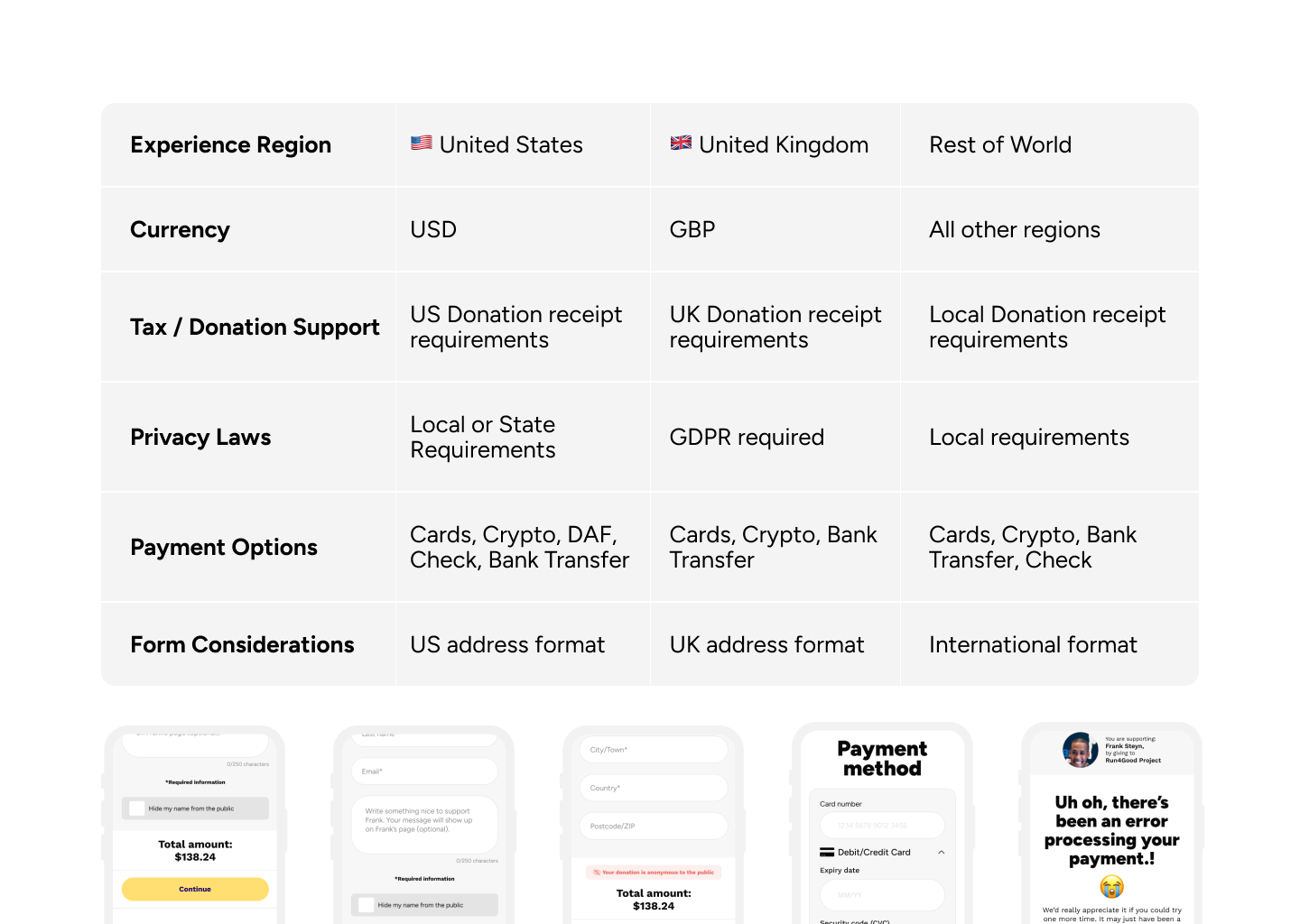
Regional Requirements for Payments
UX Exploration
Before moving into visual design, I explored several different flow structures.
Option 1: One-page Checkout
The first option kept everything on one screen: donation amount, contribution, donor details, Gift Aid, consent and payment. This reduced the number of steps but created a long, intimidating mobile page. It also made regional complexity harder to manage.
Why it was rejected: It prioritised technical simplicity over donor confidence and mobile usability.
Option 2: Traditional Multi-Step Checkout
The second option used a more conventional sequence:
Donation amount
Donor details
Payment
Confirmation
This reduced form density, but it risked losing the donor’s sense of context between steps. There was clearer progression and reduced cognitive load.
Option 3: Contextual, Mobile-First Donation Flow
The final direction combined the clarity of a multi-step checkout with a persistent donation summary and region-aware logic. The journey was designed around three primary stages:
Choose your donation
Confirm your details
Complete payment
The donor could always see:
Fundraiser or campaign name
Charity name
Selected donation amount
GivenGain contribution
Final total
Currency
This became the basis of the final experience. I still needed to incorporate possible new payment methods like Crypto and DAF payments as well as showing Gift Aid options for the UK region.
Measuring Success
The redesign was intended to improve both donor experience and platform sustainability.
The most important measures to track after launch were:
Mobile donation completion rate
Conversion rate by region
Checkout abandonment by step
Payment failure rate
Time taken to complete a donation
Usage of Apple Pay, Google Pay and other accelerated payment methods
Gift Aid declaration completion rate in the UK
Contribution acceptance, adjustment and opt-out rates
Donation-related support requests
Repeat donor behaviour
Donor satisfaction or post-donation trust feedback
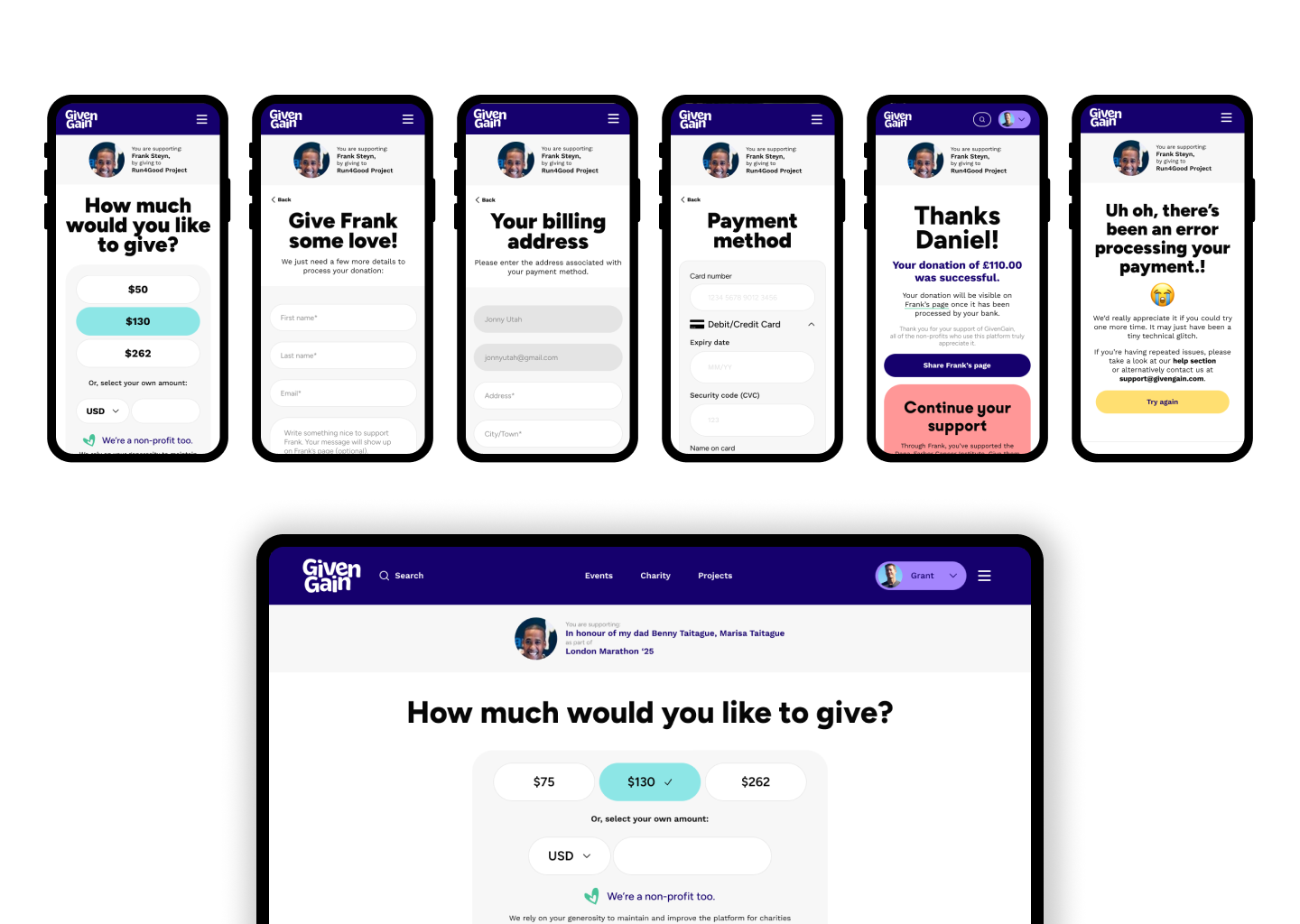
Results
Mobile completion increased by 10%, while usability participants consistently described the journey as easier to understand and less overwhelming on smaller screens.
The new contribution component was a commercial success for the business straight from launch with over 60% of donors opting to contribute an amount to GivenGain. In testing, donors understood that the contribution was voluntary and could explain what it supported. Further A/B testing enabled us to improve this communication even further.
Improving the explanation of what Gift Aid is and what it does for charities reduced confusion for UK donors and increased completed Gift Aid declarations in the UK by over 20%.
Crucially, donation volume and donation amounts as well as contributions to GivenGain itself all experienced an upward trend across all our regions.
The new payment options screen enabled us to add new integrated payment methods when they were ready without disrupting the original flow.
Outcomes
I redesigned a high-stakes global donation journey where trust, emotion, regulation, payments and mobile usability all had to work together.
The goal was not simply to reduce friction, but to help donors feel confident that their money was going to the right cause, in the right amount, through a platform they could trust.