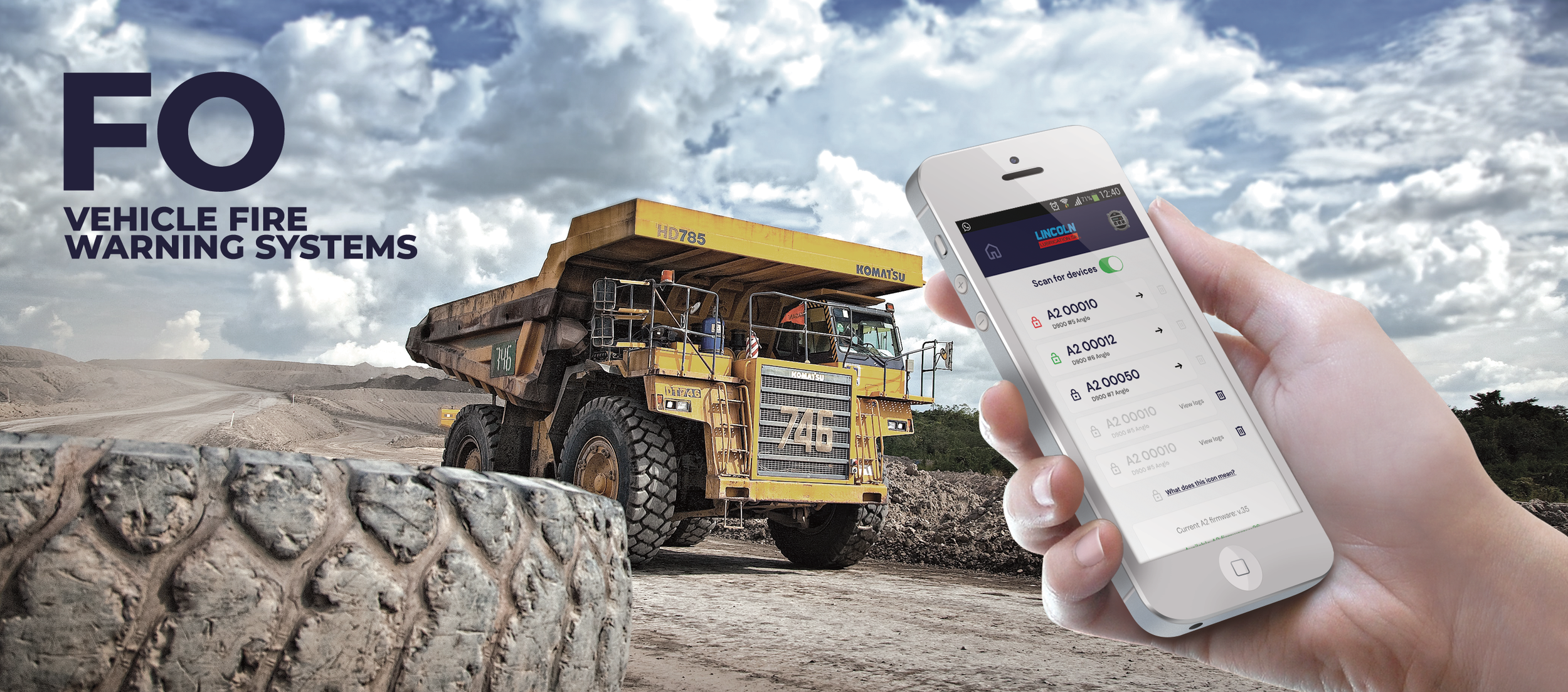
As part of their unique offering FO provide a mobile app that can be used to remotely control the consoles in the vehicles as they are on the move.
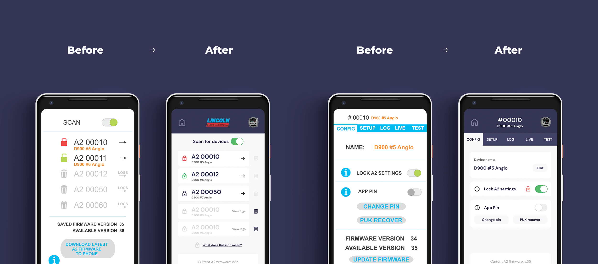
FO were happy with the general underlying UX of their app, but from some internal research, found that the UI of the app was poor and was not presenting the app and the UX in the best light. It looked unprofessional and was creating user problems.
This is a very functional app used by people who are on the move in their trucks as well as users in the head office who are using the app to control the fire warning consoles remotely.
The app needed to be free of unnecessary clutter and help the user complete the tasks and tests that they needed to do without any fuss or complication. The company wanted to license the app to other companies, but while it had a functional app, it didn’t have a professional looking one.
Challenges
No branding guidelines
No design system
No formal quantitative or qualitative research feedback
Short deadline. The app with new UI needed to be relaunched in less than a month. I had one week to improve the experience
Goals
Understand the main app UI friction points
Improve the app UI experience
Create a UI that could be white-labelled for other brands who would license the app
The Process
The business has been using their app for awhile and while the general UX feedback was good, they knew their UI wasn’t up to scratch.
First Steps
A review and audit of all the relevant screens and the current UX journey flows.
Identify primary user flows
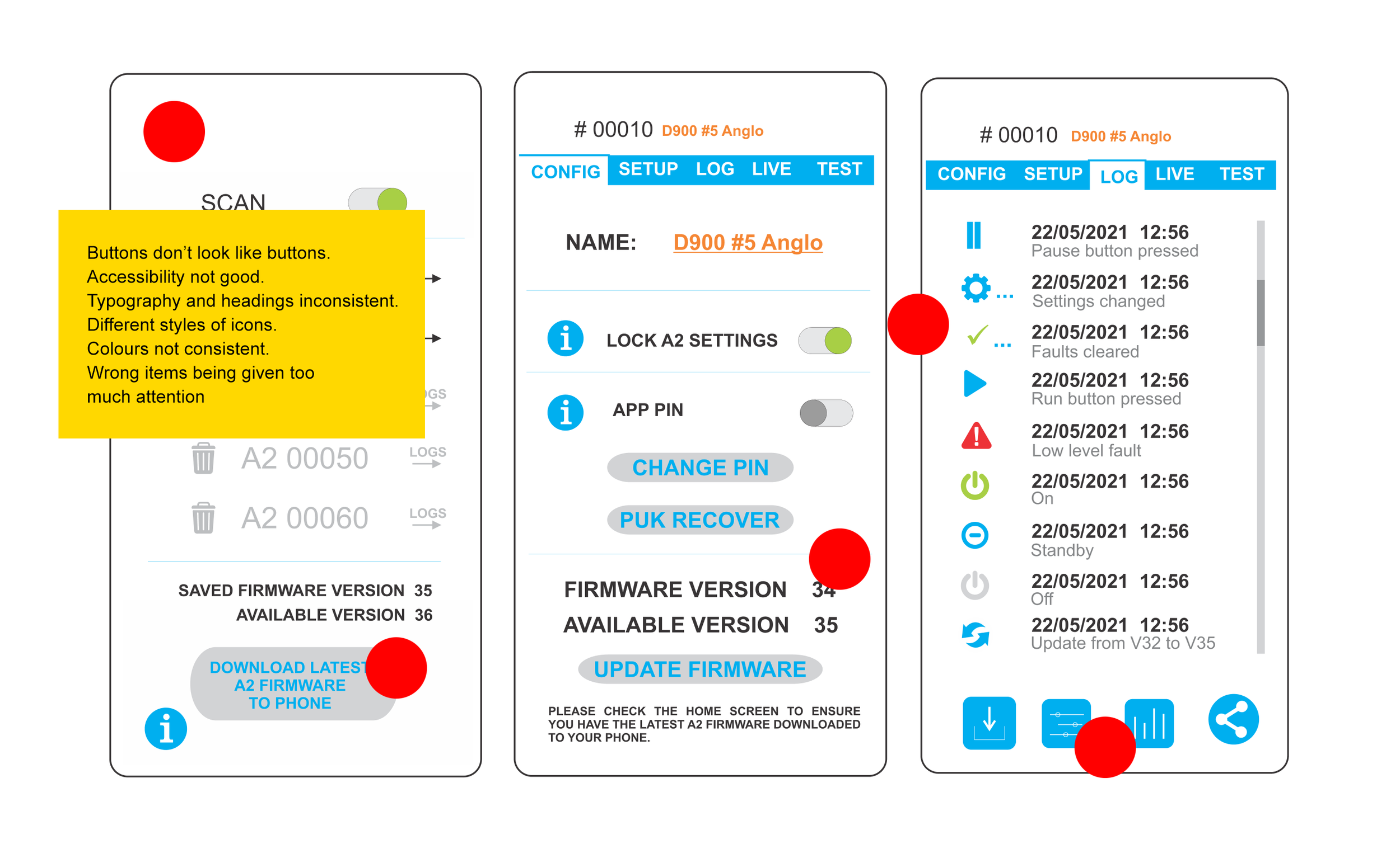
A rapid user test session of the app to understand the main friction points and UI failings using the primary user flows
Create a conceptual UI direction option for the client.
Create a framework for a new app design system.
Obtain sign off on a creative UI direction and roll out app screens.
Create prototype using the new screens
Rerun the rapid user test session of the app to verify improvements and goals and surface any further friction points.
Passive Research
As always as one of my main steps, I conducted research into similar services and how they presented themselves in terms of branding and UI. I pulled these influences and inspirations together and presented them to the client.
User Testing
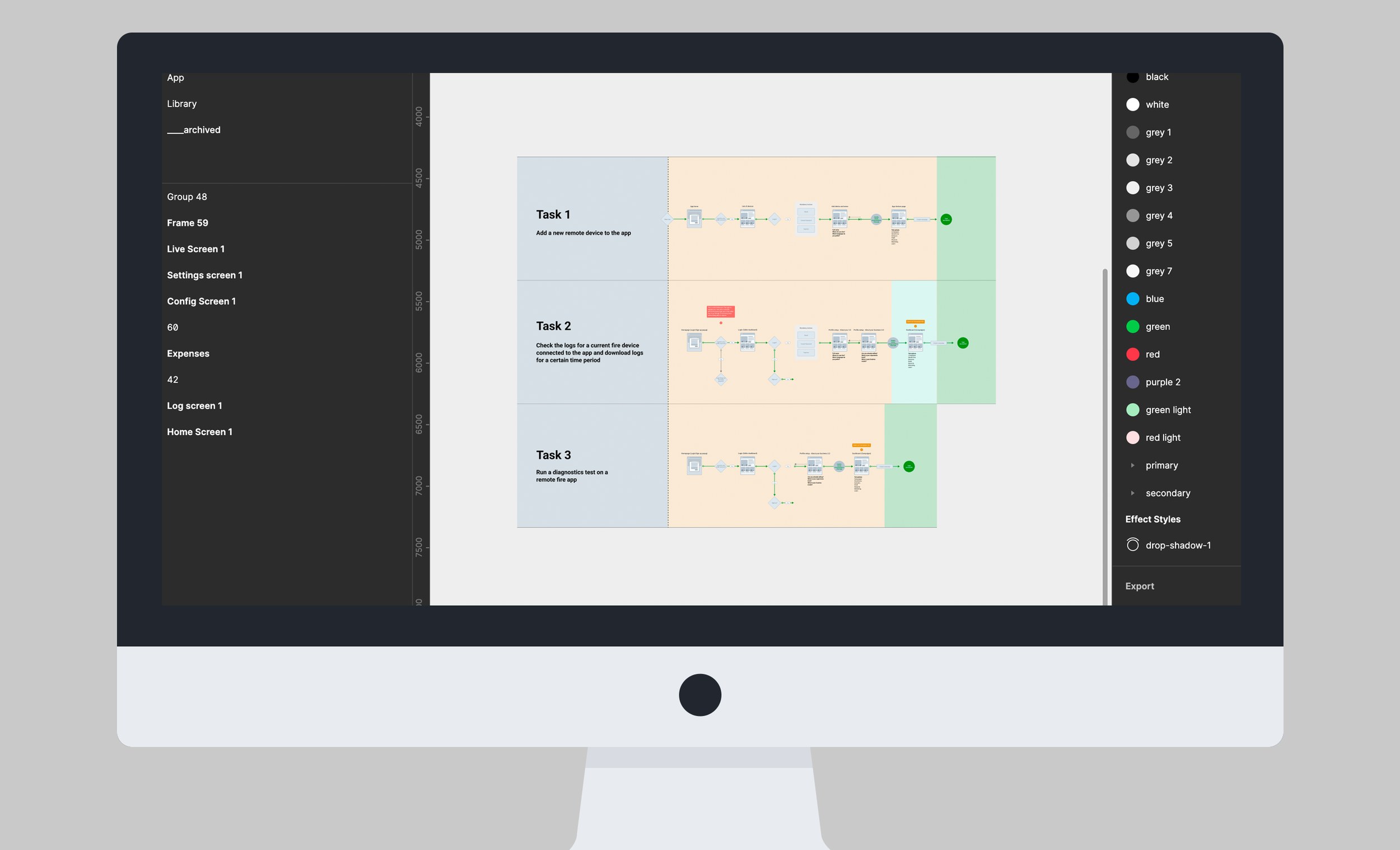
I identified 3 major tasks (user flows) that users needed to do on the app and then I asked 5 users to attempt these tasks and recorded their actions and feedback.
Add a new remote device to the app.
Check the logs for a current fire device connected to the app and download logs for a certain time period.
Run a diagnostics test on a remote fire app.
Findings:
Overall, the tasks were completed, but not smoothly and with some guessing at times.
Some of the icons caused confusion and were not intuitive
Lack of button and feedback micro interactions was causing confusion and doubt.
Screen titles and overall navigation was confusing and needed clearer cues and highlighting.
There were areas which needed clearer communication and labelling which would improve UX.
There was a lack of consistency with typography and headings. No thought had gone into text or labelling or additional information copy
The colour palette looked cheap and there weren’t enough colour variations for different interactions.
Design Approach
Using the research findings and the wider product goals as a guide, I focused on making the app feel clearer, more dependable and ready to scale.
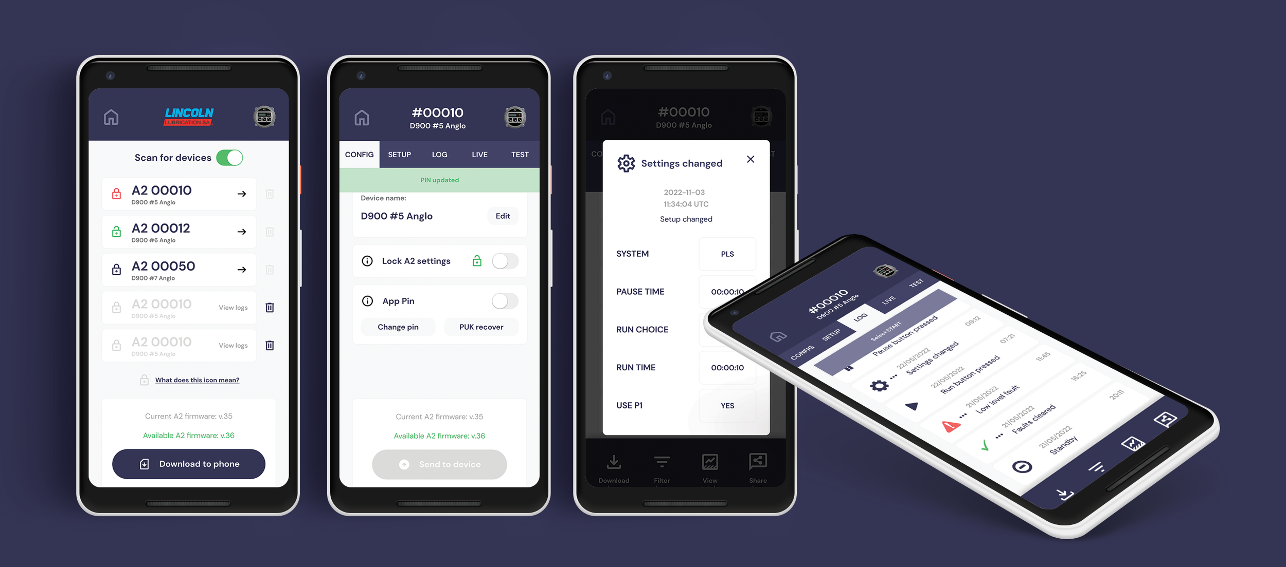
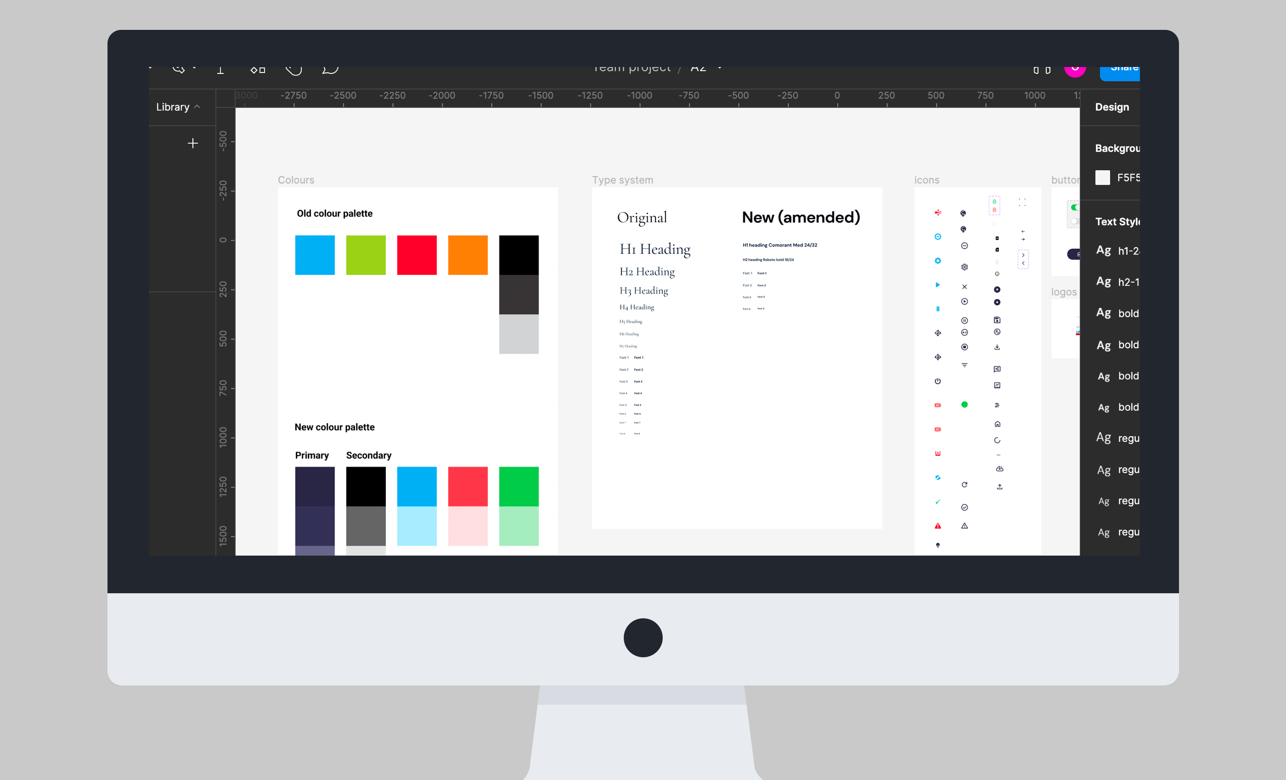
I created a new mobile-first typography system that improved hierarchy, readability and consistency across the app.
I introduced a more considered colour palette that felt professional and neutral enough to support future white-label versions, while still providing enough contrast and flexibility for statuses, feedback, alerts and key actions.
I rewrote screen titles, labels and supporting copy throughout the app. This removed unnecessary language, improved wayfinding and gave users clearer feedback at each stage of a task.
I then redesigned the full set of app screens around a simple set of UI principles:
Keep users in control of the interface.
Make interactions feel clear, comfortable and predictable.
Reduce cognitive load by removing unnecessary clutter and ambiguity.
Create a consistent visual and interaction system across every flow.
The result was a calmer, more intuitive interface that made complex operational tasks easier to complete with confidence.
Outcomes
I turned the redesigned screens into an interactive prototype and asked the same five participants to repeat the original three task scenarios. This made it possible to compare performance, confidence and feedback against the first round of testing. To demonstrate how the product could scale beyond FO’s own use, I also created a white-labelled version for a fictional customer brand.
The results
Participants completed the key tasks 40% faster, with fewer errors and less hesitation.
Clearer navigation, labels and feedback helped users understand where they were in each flow and what to do next.
Users reported feeling more confident throughout the experience.
The redesigned interface was consistently described as calmer, clearer and more intuitive.
“I felt much more confident that I was on the right path.”
“I love the new colours and design. The app feels faster and slicker.”
“Goals are much easier to accomplish now, and there is more communication from the app at each step.”
The redesign transformed a functional but visually inconsistent product into a more polished, credible and commercially ready platform—one that FO could confidently present to future white-label partners.